Data is all around us, even in the human interest subjects that might not seem as empirical as others.
While data journalism is often associated with hard science and empirical topics like economics, business, and politics, it’s important to remember that data is omnipresent and can be used to illuminate all kinds of topics, including arts, culture, and lifestyle.
By making use of pulled data, graphical representations, and narrative story-telling, these stories highlight the flexibility of data reporting in human interest subjects, proving that data is all around us—if you know how to look.
1. A look into Stephen Curry’s three-point shooting legacy by the numbers by Mariane Avendaño
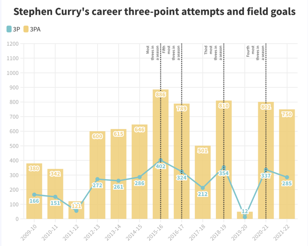
This article by Rappler breaks down NBA superstar Stephen Curry’s record-breaking three-point shots, his impact on other players in the league, and professional basketball as a whole.
Sports is probably one of the most common daily applications of data and data journalism outside of the hard sciences. Breaking down statistics and probabilities into the gameplay and its implications for a team or sport is a great example of how numbers can tell us qualitative information and aid in decision-making.
2. Box office breakup by Samuel Hart
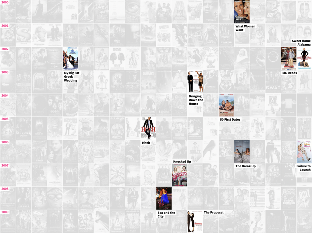
With the help of graphs and theater sales data, Reuters puts together a picture of the rise and fall of the romantic comedy film genre in the United States. As producers, theaters, and audiences embraced a shift to action-packed blockbusters, the charm and humor of rom-coms have struggled to regain the ground it had in the 1990s.
3. Tracking My Kid’s Daycare Bugs in a Virus Data Visualization by Zach Rottman
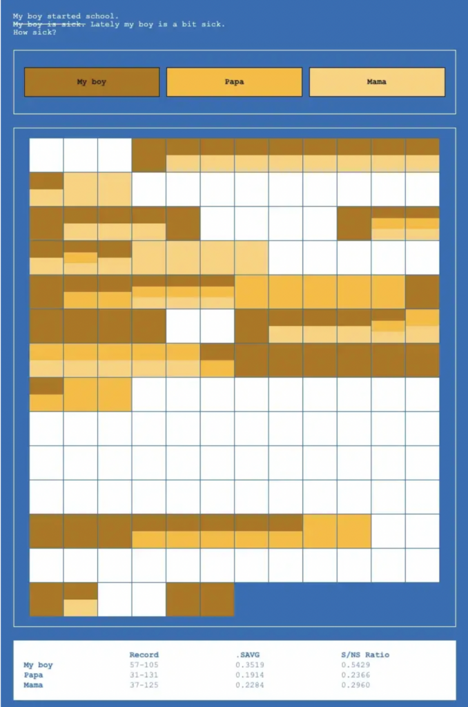
Turns out data isn’t just for nerds. It’s also for parents in need of some stress management. Using a MySQL table and grid cells for his experiment “My boy is sick,” Rottman logged the days that his toddler, his partner, and Rottman himself fell ill as their son started attending daycare.
What started out as an “art project” for Rottman evolved into something that gave him reassurance. Data—despite or thanks to its matter-of-fact reputation—can give enlightenment into human experiences; those tough days of runny noses and a virus-laden household would be outnumbered by days spent without any medical worry.
4. Wordle, 15 Million Tweets Later by Robert Lesser
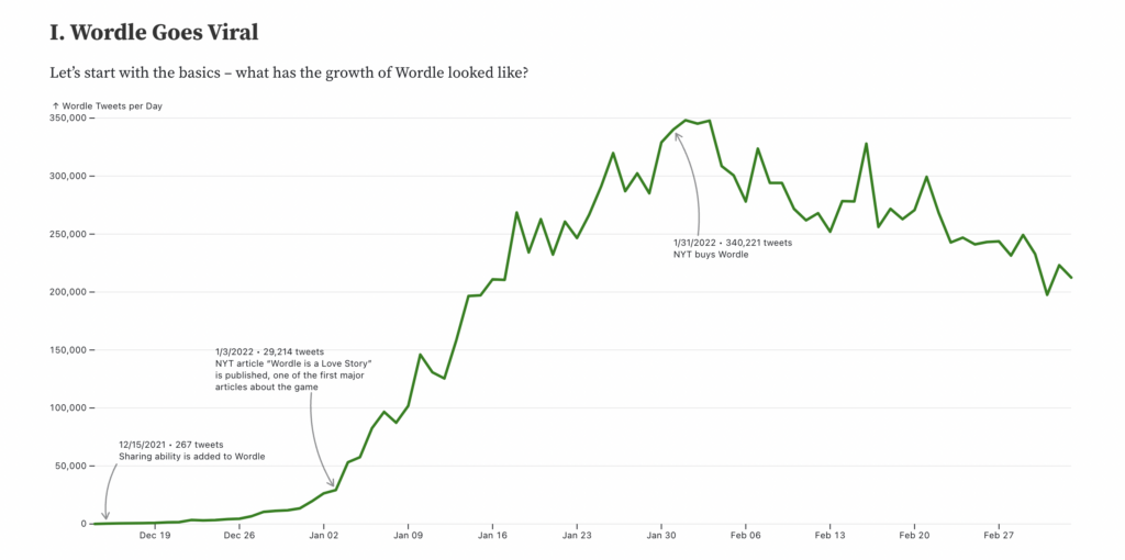
If you were online and bored during the pandemic drawl in 2021, you may have played the word game Wordle. The one-game-a-day puzzle took Twitter by storm as players shared their scores to either bemoan or boast about that day’s Wordle.
By using a semi-automated program and Twitter’s API, Robert Lesser lays out how Wordle grew in popularity, the patterns in success—or fail—rates, and whether or not people think it’s been getting harder.
5. Get out of your geographic music bubble by The Pudding
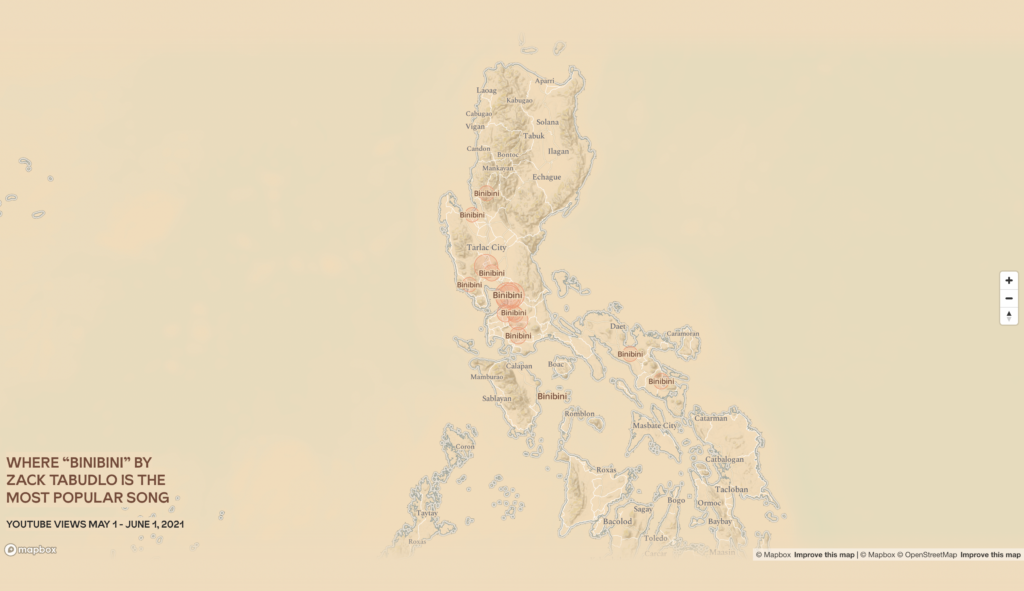
Much like music tastes, data can be something so personal to each one of us. Released by The Pudding, this data story lays out the most popular song from March 2021. in a viewer’s estimated location to get an idea of what songs are trending within and outside of a “music bubble.” This amazing story takes personalization to a whole new level by approximating your geographical location to see how popular music spreads in patterns and might vary from place to place.
ALSO READ: Five Interactive Stories that Bring Data to Life
Everything we interact with is powered by data in some way. Whether it’s statistical or anecdotal information, we can make use of these points to glean insights and make better decisions and strategies—even if we might think the numbers don’t matter to our field of work. By using data to uncover insights and tell compelling stories, publications demonstrate the power of data to illuminate even the most subjective and intangible aspects of human experience.
M2.0 Communications is a public relations agency that has been helping brands tell meaningful, data-driven narratives. Visit our work to learn more about the brands we collaborate with.


