Readers should be participants when we talk about data. Let them play an active role in understanding data with interactive storytelling.
People are constantly seeking new and innovative ways to understand and analyze data. Through the use of color coding, highlights, animations, and other techniques, interactive data visualization provides a more intuitive way to understand data by allowing users to interact with and explore the data in a dynamic and visually appealing manner.
In this article, we take a look at five interactive stories on data journalism that are worth reading, showcasing the power and impact of this innovative method of data representation. Whether you’re a data analyst, a journalist, or simply someone who wants to stay informed about the latest trends and developments, these articles are sure to provide valuable insights and inspiration.
1. “What Happens to the Plastic We Throw Out?” by National Geographic

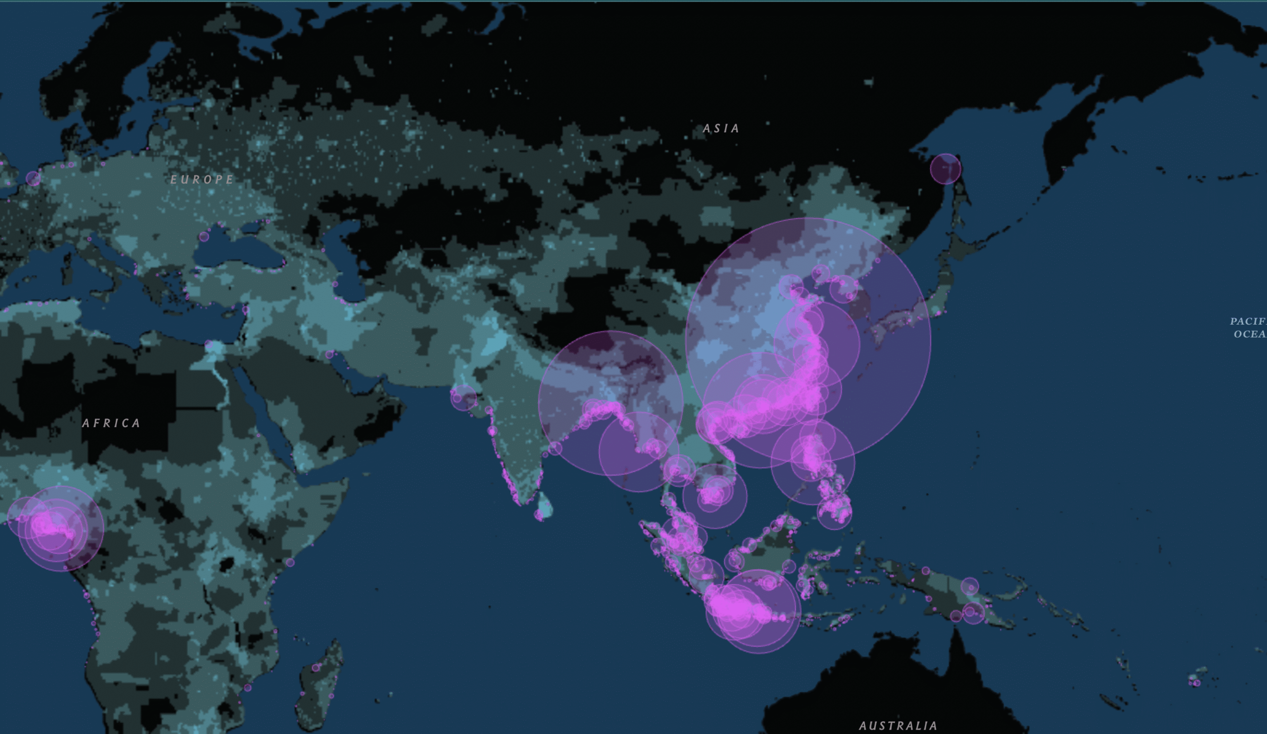
This is an interactive map created by National Geographic to show the global trade flows of plastic waste. It highlights the countries that export and import the most plastic, and provides a visual representation of the global trade networks for plastic waste. The map is designed to raise awareness about the issue of plastic waste and its environmental impact and to encourage people to take action to reduce plastic waste.
2. “Who’s In Your Wallet” by The Pudding

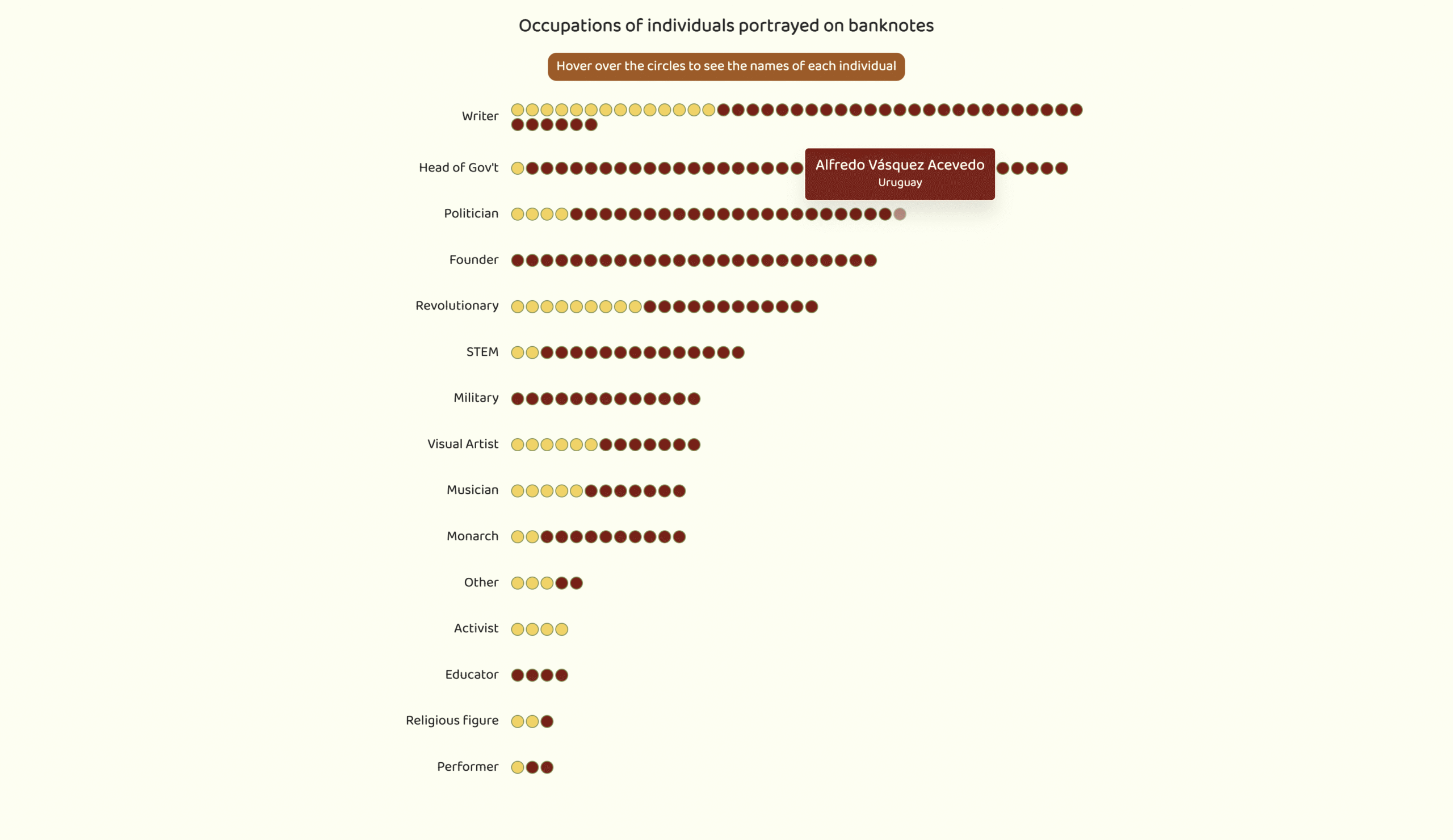
This visual essay covers over 200 banknotes from around the world to observe any patterns in who are the faces of global currencies. The Pudding looks at the gender, occupation, and value of these notes. Using charts, scatter plots, and galleries, readers can scroll through an in-depth look into the history of currencies.
3. “A Disappearing Planet” by ProPublica

This visualization provides an in-depth look at the current state of global wildlife, specifically focusing on the decline in species populations over the past several decades. The visualization allows users to explore data on species populations and distribution, including information on the most endangered species and the impact of human activities on these populations.
4. “Philippines’ performance in Olympics” by Philippine Center for Investigative Journalism

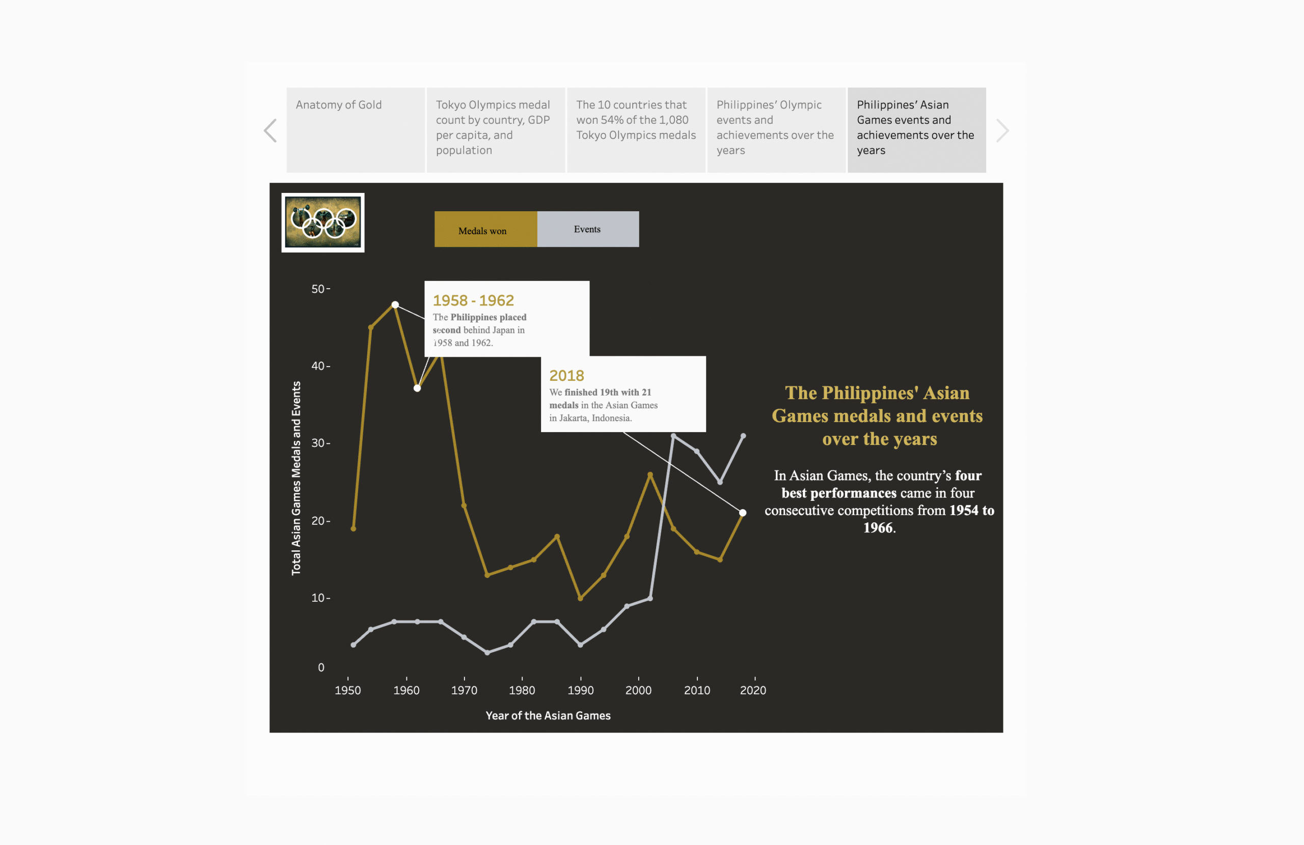
The Philippine Center for Investigative Journalism released a report following a historic golden win at the 2021 Tokyo Olympics at the hands of weightlifter Hidilyn Diaz. PCIJ makes use of color-coded graphs and timelines on the performance of Filipino athletes during major sporting events like the Asian and Olympic Games, allowances and financial budgets, and what goes into a gold medal win.
5. “Always in Best Spirits” by Kontinentalist

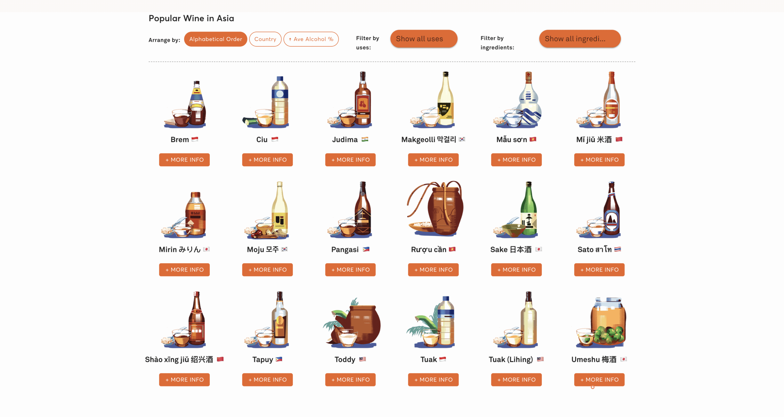
Kontinentalist lays out the production and consumption of alcoholic beverages across Asia. There are graphs about the biggest drinkers, grain producers, and top-performing markets. The article also includes galleries of Asian wines, beers, and spirits that readers can filter according to average alcohol percentage and country. Each drink can even be clicked to learn about the history of the drink.
These interactive visualizations showcase the power of this medium to convey complex information in an accessible and engaging way. They offer a unique perspective on important issues and allow readers to engage with the data in new and meaningful ways.
Related Content
- How Data Management Can Boost Brand Reputation
- From Onions to Adobo: How Data Reporting Can Help Us Understand Inflation
- Why Data Visualization is a Powerful Storytelling Tool
M2.0 Communications is a leading communications agency that helps brands creatively tell their stories through data-driven narratives. We offer services including PR advisory, reputation management, influencer management, and video production. Visit our Partners page to learn more about the brands we collaborate with.


